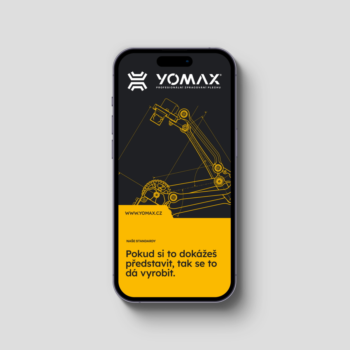
A Precise Refresh: Crafting a New Visual Identity for YOMAX
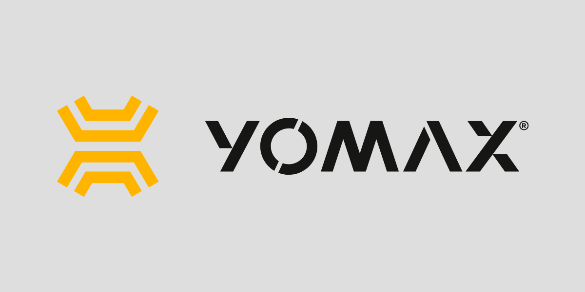
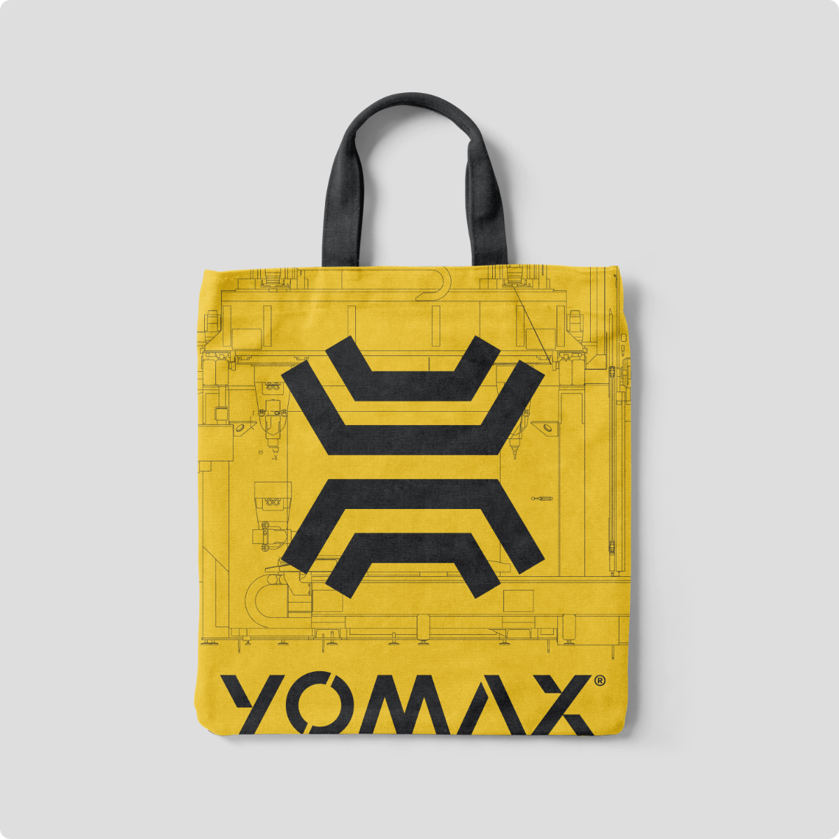
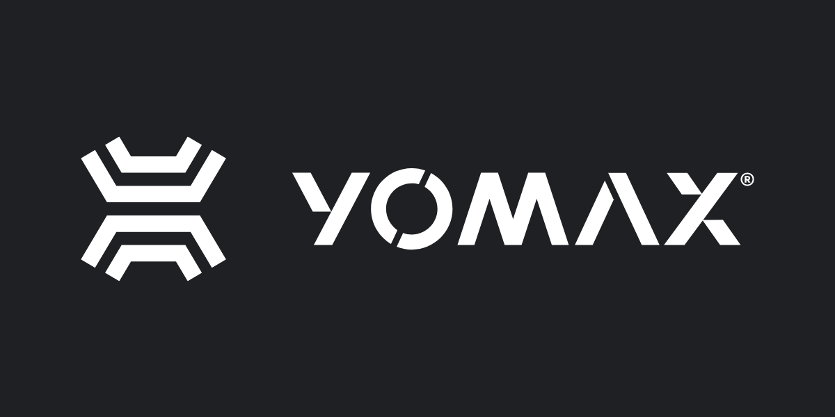
YOMAX, a company specializing in high-quality sheet metal processing using top-tier CNC machines, approached us with a request to refresh their existing logo. So, we designed a concept that fits with millimeter precision—just like their expertly cut metal components.
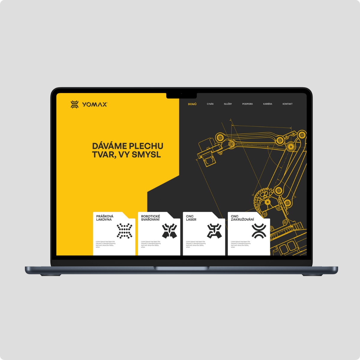
But we didn’t stop at the logo. While developing the new visual identity, we focused on capturing YOMAX’s core values: tradition, precision, and innovation. This vision came to life through an industrial-inspired color palette, technically precise typography, and graphic elements influenced by CNC machining.
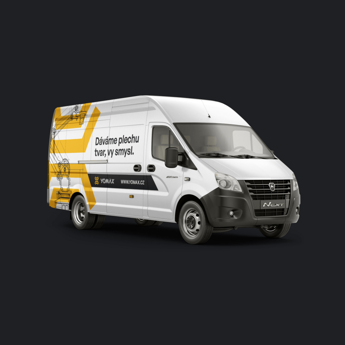
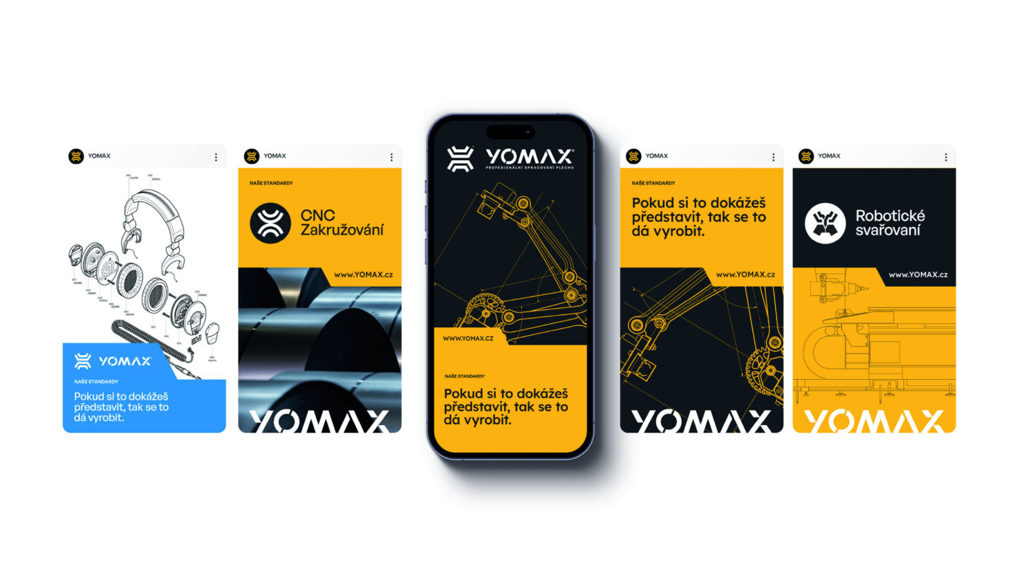
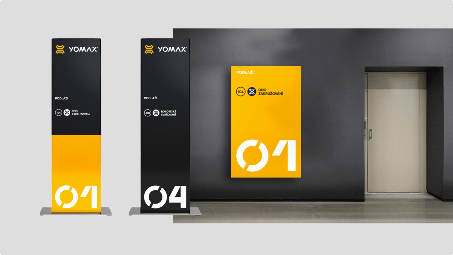
The new visual style reflects the company’s technological excellence, which we applied across letterheads, factory infographics, websites, business cards, and various marketing materials. Simply put, we fine-tuned what we do best!
Client
Yomax
Services