Visual Identity For A City with Tradition at Heart and the Future in Sight
Frenštát pod Radhoštěm isn’t just a town—it’s a community rooted in tradition while embracing modern times. When competing to design the new visual identity for this Beskydy gem, we set out to seamlessly blend the mountains, local heritage, and a forward-thinking spirit into a unified visual language.
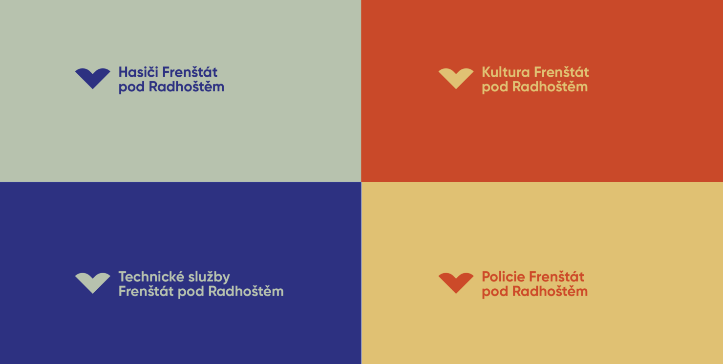
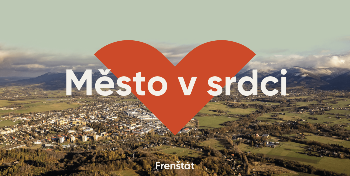
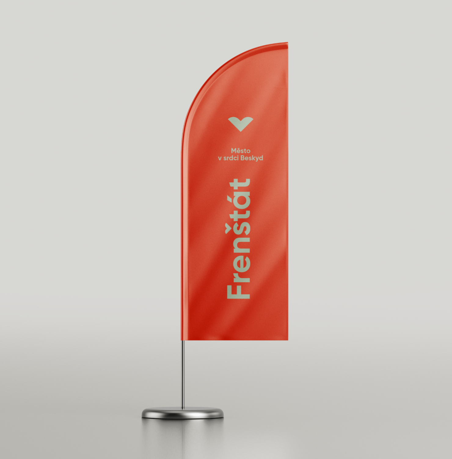
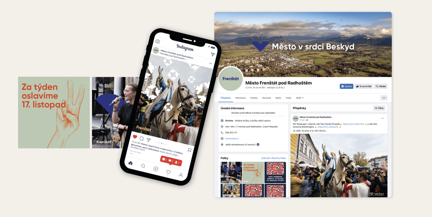
The logo tells the town’s story with a heart-shaped symbol—not just representing love for Frenštát, but also reflecting the rolling Beskydy hills surrounding it. The háček (hook) in the shape of a heart tucking behind the mountains pays homage to the region’s traditions and the pride of its people. Seen from a side angle, the heart transforms into an arrow pointing forward, symbolizing progress and continuous development.
Complementing the logo is the tagline "Město v srdci" ("A City at Heart"), which reflects both Frenštát’s geographical location in the heart of Beskydy and the deep connection its residents feel to their home.
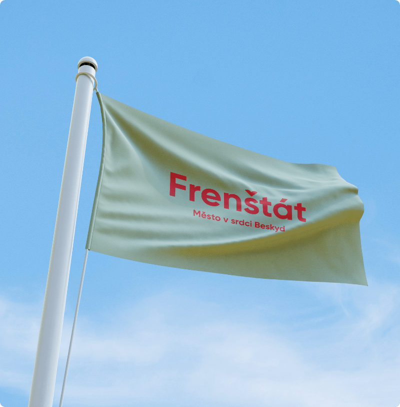
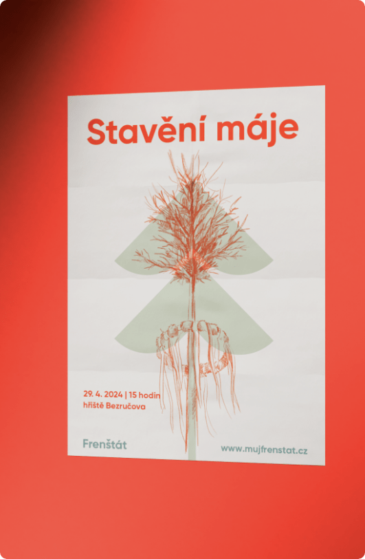
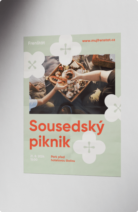
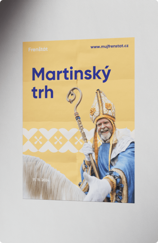
The color palette and graphic patterns draw inspiration from traditional blue-dye printing and the architectural heritage of Jurkovič’s buildings, ensuring that the identity remains true to Frenštát’s rich history and unmistakable character.
Client
Frenštát
Services